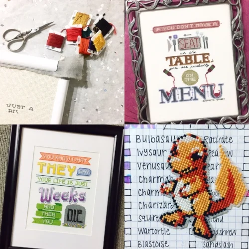
Why Test Stitching Patterns is Important
Most of us have experienced it before; we find a pattern, likely on Etsy, fall in love with the idea of it, buy it, download, purchase supplies, sit down to stitch and... there are issues with the pattern. When you get a close-up look at these patterns, stitches are out of place, there's only one stitch of that color you went to two different stores to try to find, or the symbols are so alike you need a magnifying glass and some Tylenol to power through it.
Cross stitch patterns and designs are made (mostly) by humans, so some margin of error is going to be present. However, a good majority of mistakes could be prevented through the process of test stitching, revision, or even just sitting on a pattern and coming back to it after a day once the final draft is completed.
Even when it comes to some of my simplest designs, I can't bring myself to publish them in my store until they're stitched up. I find that I often play around with colors and alignment once I'm physically working with the thread and fabric. Read on for issues I've had in designing and how the test stitching process, albeit grueling at times, helps control these issues after a pattern is published.
Alignment
I'll start with my most tragic testing experience. In November 2016, I published my Yes I Can pattern. I had to stitch this three times. The first time I was stitching the chevron pattern and it was not lining up. I thought this was due to miscounting, but as it turns out, the pattern itself was off by one pixel, throwing the entire geometric pattern off. Is this a simple design? Yes, it's probably one of my simplest yet. But this was probably lesson #1: Make sure things align before you publish them. This alignment goes for making sure that pieces of the design match up, that patterns are symmetrical and centered, and to ensure that back stitching actually hits each hole and isn't in the middle of a square somewhere.
While this hasn't happened to me, I should also take a moment to mention spelling here. This probably goes without elaboration, but I've seen Etsy listings with spelling errors. Yeesh. While it may be that spending a lot of your time with your design makes spelling errors difficult to see, I'd like to think that many of these could be tested out. A simple spelling error correction though could drastically change the look of a pattern, including its alignment and size.
Color Matching
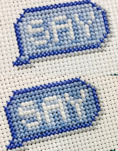
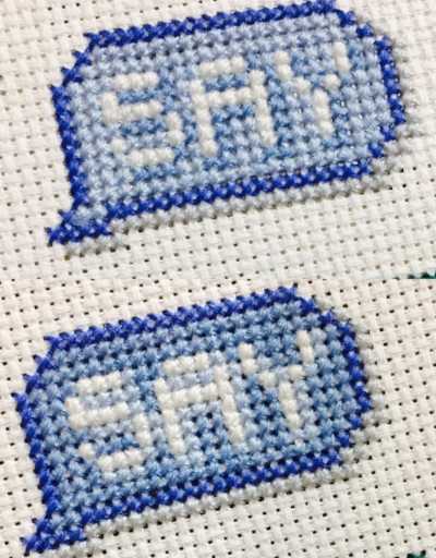
Top: Finished version; Bottom: Wrong color matching
There is some amazing stitch software out there. I use MacStitch, the Mac computer equivalent to Winstitch created by Ursa Software. I could go on for a long time about all the wonderful features and how much I love MacStitch. However, there is one color series in particular I've noticed it doesn't get quite right: the difference between DMC 809, 813, and 800. In my software, the contrast shows up differently than the real thread.
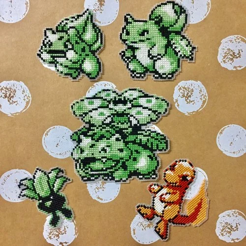
I learned this through working on my Pokemon sprites for the water-type Pokemon, and when test stitching my Your Life is Just Weeks and Then You Die pattern. For the most part, design software is surprisingly accurate. However, designers can only account for or notice these errors that won't portray their vision in the finished stitch if they're working intimately with the colors. I had to unpick the entire "say" portion to achieve the look I wanted and was able to publish it with confidence. You can see in the picture to the right that the original version would not have made sense; why have a shadow with a lighter color?
Ease of Use
One major portion of quality control in test stitching means making the pattern easy to read. For those reading patterns on their screen or printing with colors blocks and symbols, this is not too big of a deal as the color contrast provides extra guidance. For those, like me, who stitch using black and white with symbols though, a little tender loving care to symbol selection can go a long way. First of all, the square symbol is the symbol of hell. It's a square within a square and makes it, at least to me, impossible to count and distinguish. My eyes just can't comprehend it. So each of my patterns have that symbol edited out, though sometimes I miss this step. When I'm test stitching, I'm starkly reminded that it's there. It can also be a pain if symbols resemble each other too closely. If a designer can't read their own pattern, how would they expect someone else to? I find that this is often overlooked in patterns that are published without testing, and have heard many a disgruntled stitchers complain about this.
Framing Suggestions
Last but not least, I find it important to make sure a model is stitched up so that I can offer framing suggestions. I design a lot of my patterns to fit in 8" x 8" frames because it's a very user-friendly size that looks great. This doesn't mean that my design can fill the entire 8 inches squared because if that's the case, the edges will get cut off during framing. When I stitched my Wi-fi Sweet Wi-fi pattern, I couldn't frame it in the size that I had wanted (or that the software told me) because I didn't account for this. Fortunately, I was able to find a frame that fit and offer suggestions so that those purchasing and stitching the pattern wouldn't have to go through that. In this same vein, it's very important to me to have a good picture of the design to reference in my pattern listings. This way, there are no surprises when it's finally stitched and people know what to expect.
Conclusion
This post sounds like I'm terrible at counting or make silly mistakes in the design process. Well... that's actually true. A lot of pattern designers out there also make silly mistakes, only theirs unfortunately end up in their own designs. I'm not saying it's a terrible decision not to test stitch, but it has improved the quality of the patterns I've made. It can be really tempting to be able to publish designs in rapid fire. In fact, as you may have noticed, this means that my productivity in publishing patterns is not equal to that of many. However, all these mistakes that I've made during my process means they're mistakes that customers don't have to make. Which means, all things considered, I'm pretty okay with taking that on. For that reason, I also have a list of pattern sellers that I trust and know they also undergo a testing phase so that when I purchase a pattern, I can purchase with confidence. In my opinion, testing is the best way to ensure that the design I intend to make is put out into the world in a way that produces the least amount of headaches.
Have you ever had a bad pattern experience? Made a really bad mistake while stitching? Let's hear about it in the comments below! Or, submit your horror story via the Contact button for use in a later post discussion on user-submitted stitching horror stories.

